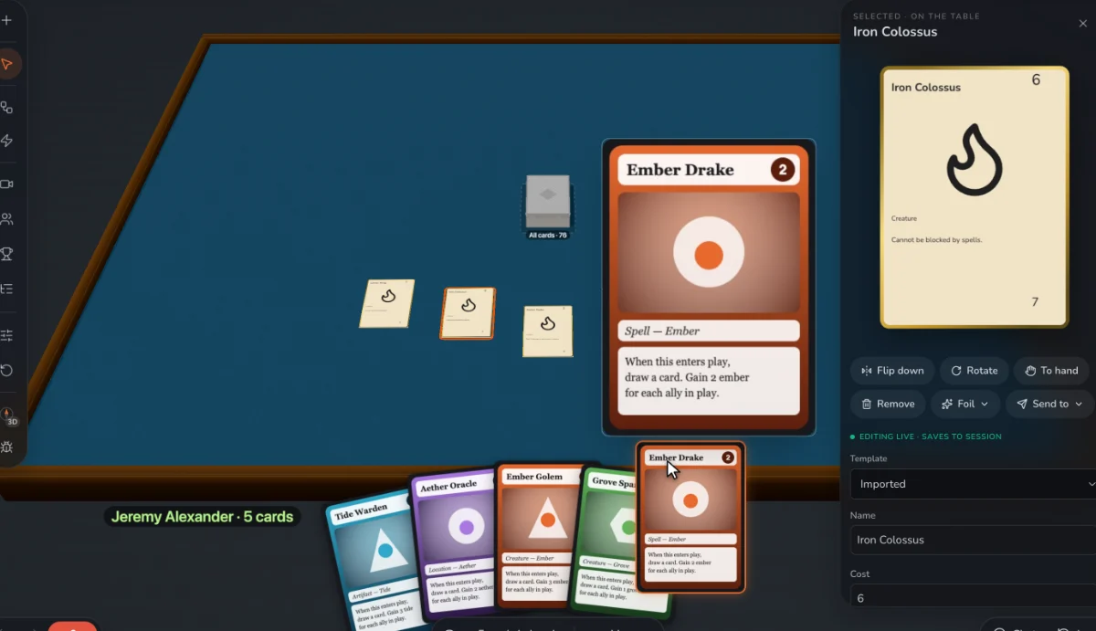
Put what matters where a fan shows it
Held in a hand, most cards show only their top-left corner. Whatever a player needs when choosing a card, such as a number, a suit or a cost, belongs there.
Make a hierarchy
A card should be read in order: what it is, what it costs, what it does, then everything else. Size, weight and position set the order. If everything is bold, nothing is.
Use readable text sizes
As a rough guide, body text under about 8 points gets hard to read on a printed poker card. Long rules text is a sign to cut words, change the rule or use a larger card. Print one to check at real size.
Keep the same thing in the same place
Cost is always in one corner, type always in one band. Players learn your layout once and stop reading it. Every exception costs attention.
Never rely on color alone
A meaningful share of players have some color vision deficiency. Pair each color with a shape or icon, and check that your cards still work in grayscale.
Write rules consistently
Use one word for one thing, every time: if it’s “discard” on one card, don’t make it “throw away” on another. Icons can shorten text, but only if players can learn them quickly and there’s a reference.
Keep to the safe area
Keep text and key art about 3 mm inside the cut line, and extend backgrounds about 3 mm past it. Cuts drift, and this hides it.
Mind contrast over art
Text over busy art is hard to read. Use a plain panel behind rules text. Avoid big dark backgrounds for anything people print at home, as they eat ink and show wear.
Test before you print
Look at the card at its real size, and at table distance. Then watch a new player: if they keep asking what something does, your design isn’t finished.
Step by step, in Prototable
- Set the real size. Pick a standard card size, so what you see matches what you print.
- Place fields once. In Templates, every card follows one layout, so nothing drifts.
- Check a full deck. Look at your longest card in Data. If it doesn’t fit, cut words before you shrink text.
- See it on the table. Deal a hand and fan it, and check that the corners read.
- Print a test sheet. Open Print, turn on bleed and cut guides, and look at real paper.
Questions
What font should I use for game cards?
A clean sans serif or a sturdy serif for rules, with something more characterful for titles only. Check that numbers like 6 and 8 stay clearly different at small sizes.
What size should my cards be?
Poker size, 2.5 × 3.5 inches, unless your game needs something else. It’s what most sleeves are made for.
When should I add art?
After the numbers settle. Do design legibility first: a plain, readable card plays better than a beautiful confusing one.
More guides: How to prototype a card game · How to turn a Tabletop Simulator deck into printable cards · How to playtest a board game remotely · How to import a TCG deck list to playtest it · How to make a card game · How to make a trading card game · How to balance a trading card game · How to make custom cards for Tabletop Simulator · How to publish a card game · How to design a card game · How to make a board game · What is playtesting? · How to playtest a card game online.